
Role
Brand Consultant & Creative Director
As freelance creative director for Bajaku International, I took an original character ink sketch and delivered an urban apparel brand.
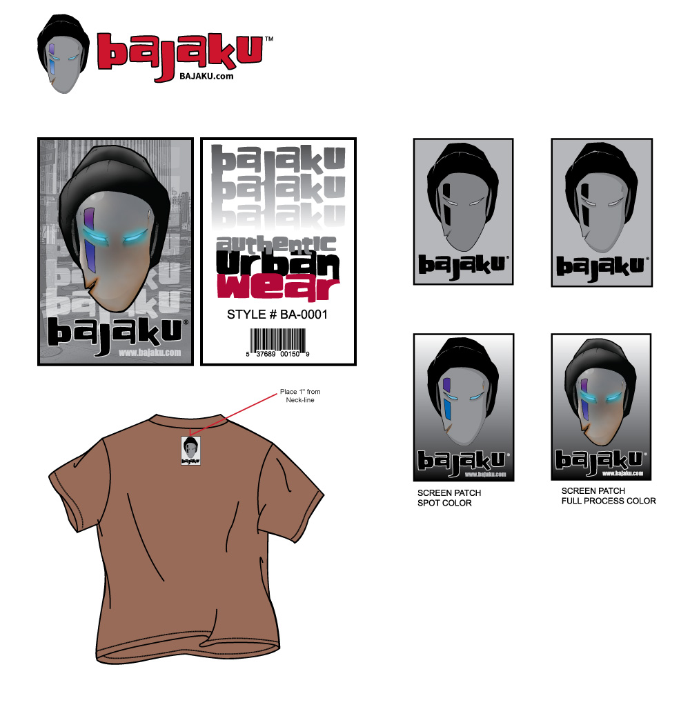
Bajaku sold an original character universe as physical product. The same mark had to hold on a full-process apparel graphic, on a chest print separated for a two-color screen, on a hangtag with a scannable barcode, and on a mail piece at postcard scale. Swipe through the finished pieces below.
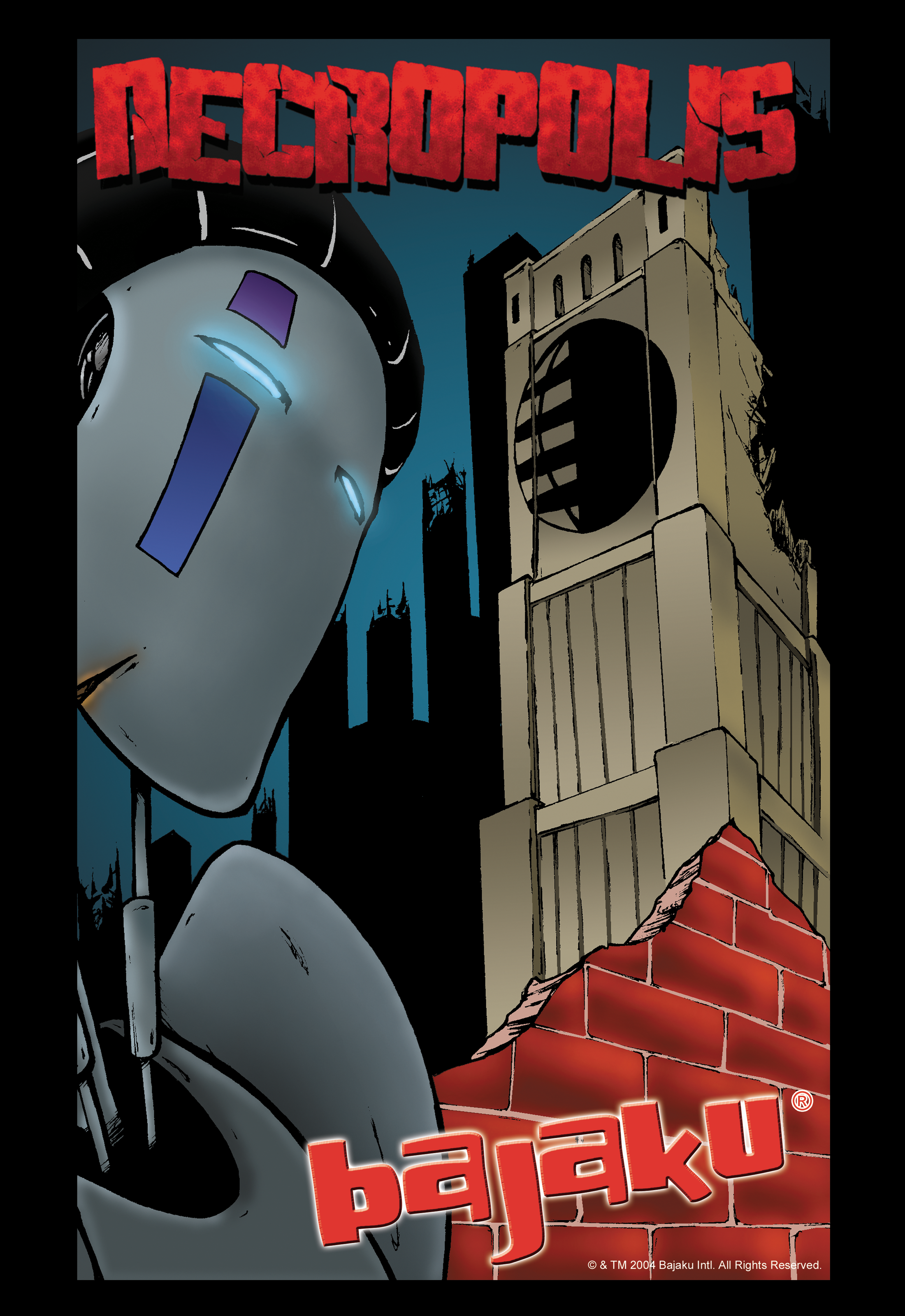
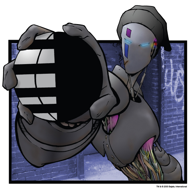
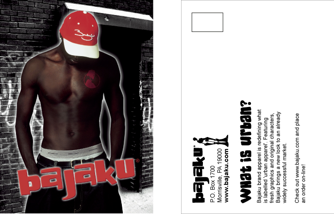
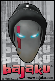
Bajaku was going to market in several categories at once on a startup timeline, with product turning over faster than any one-off design pass could keep up with. The risk wasn't a weak logo. It was drift: every new SKU arriving with its own interpretation of the brand, until the company read as five brands by the end of the first season.
Apparel graphics, packaging, patches, mail, and the corporate face of the company all needed finished artwork on the same timeline.
Screen printers wanted spot-color separations, full-color graphics ran process, retail needed a scannable barcode, offset needed its own prep.
Without a repeatable framework, each new product restarted the brand conversation from scratch.
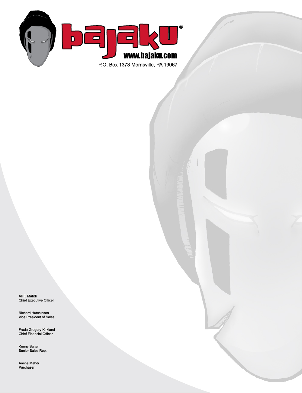
The mask carries the brand where a wordmark can't — on a chest print, on a hangtag, ghosted across a letterhead, shrunk onto a neck label. Anchoring recognition to a face rather than a logotype meant the identity survived any size and any color count.
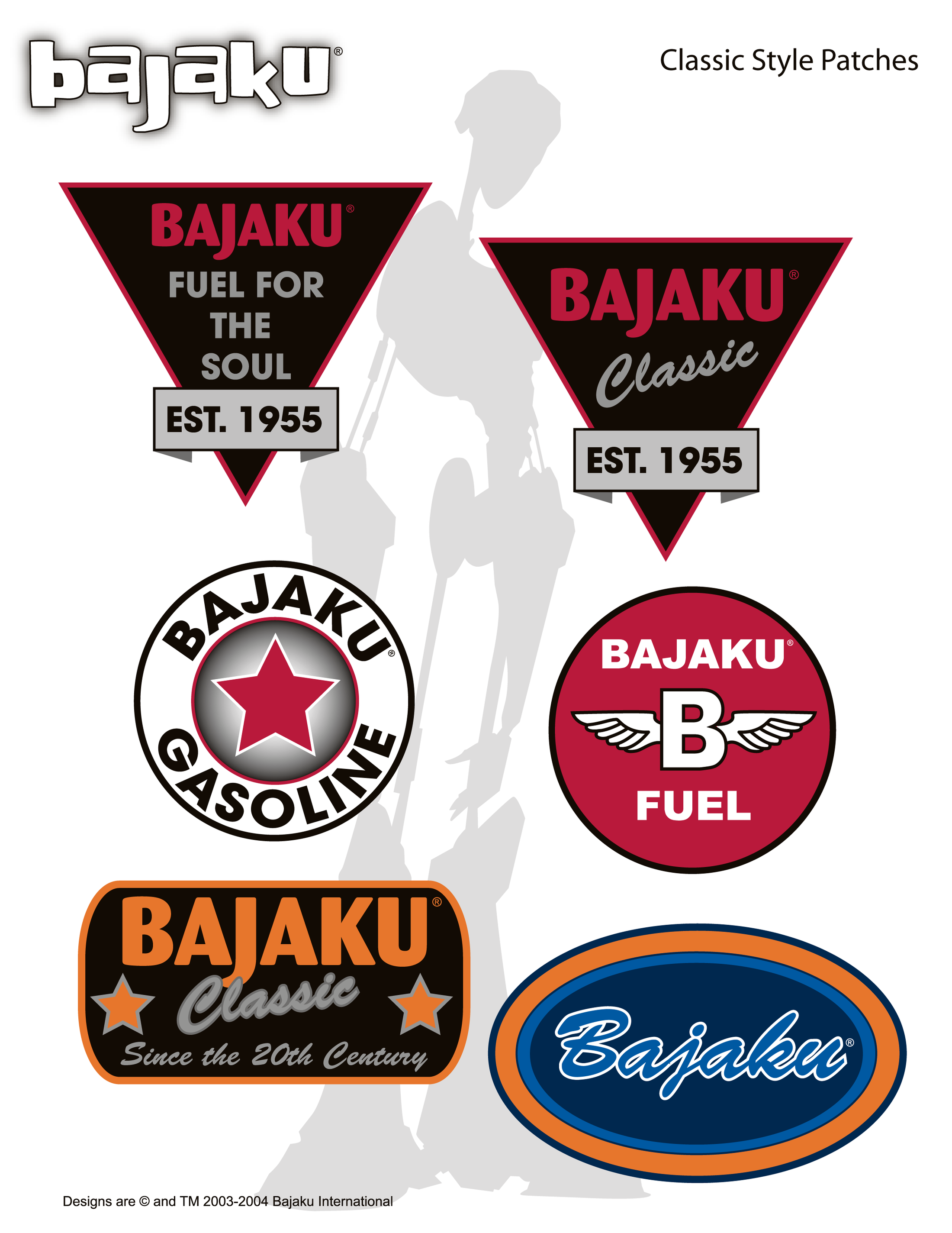
Six Classic patch marks in a mid-century fuel-and-service-station idiom gave the line somewhere to grow. New product could be added by drawing inside an established vocabulary rather than by starting another design conversation — which is what kept the turnover from fragmenting the brand.

The mail piece led with a positioning question rather than a product shot, and put the garment on a body in the environment the brand had drawn. One card doing brand work and order-taking at the same time — the argument for the line and the means to buy it in the same hand.
Wordmark and character mark secured as something the company owned rather than borrowed.
A sub-brand vocabulary that absorbed new product without diluting the primary mark.
Artwork delivered as a finished product spec, not as files a vendor still had to interpret.
A startup selling into a crowded category doesn't lose on any single piece of artwork. It loses to drift. Treating the character as the load-bearing element, and shipping every mark in the form its vendor actually needed, meant the brand arrived intact in five places at once.